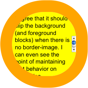
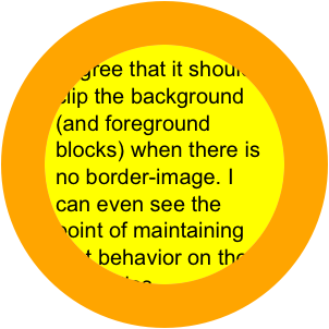
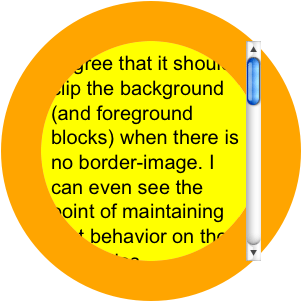
background-color: yellow;
width: 200px;
height: 200px;
font-size:20px;
padding:10px;
border:40px solid orange;

overflow:hidden;

-moz-border-radius: 150px;
-webkit-border-radius: 150px;
border-radius: 150px;
I agree that it should clip the background (and foreground blocks) when there is no border-image. I can even see the point of maintaining that behavior on those properties when border-image is in use. But the border-image might contain a more complex clipping (using a PNG, for instance), than the border-radius could achieve on its own. That might be the use case for using them together, in fact. The only use case for having the border-radius clip the border-image, is if they both have the exact same path to clip to anyway.
overflow:auto;
I agree that it should clip the background (and foreground blocks) when there is no border-image. I can even see the point of maintaining that behavior on those properties when border-image is in use. But the border-image might contain a more complex clipping (using a PNG, for instance), than the border-radius could achieve on its own. That might be the use case for using them together, in fact. The only use case for having the border-radius clip the border-image, is if they both have the exact same path to clip to anyway.
or