A Variation on the Linear-Gradient Draft
This document describes some things that are already possible with the current draft, as well as proposing some changes that would simplify how linear-gradient() images can be created. A great deal of commendable work and thought has been put into the current draft, but it can be better. The proposed changes are is based on the following assumptions:
-
Familiarity is Important
These CSS gradients will be most valuable to designers and others who commonly author and/or edit CSS rules, and should be easy to learn. Specifying gradients in CSS should be consistent with the expectations of this segment. The way that computer programmers and engineers are used to doing things is less relevant, when that diverges from the common experience of everyone else. Consistency with SVG is somewhat important, but when it too diverges from common expectations, it should be the common expectations that win out. There are more CSS authors who are familiar with design software and common-person conventions and traditions than there are of CSS authors familiar with SVG authoring.
-
Code Simplicity is Good
A primary reason for choosing to have a linear-gradient image creation function, instead of just linking to an SVG file, is that CSS allows authors to create and edit very simple and brief code snippets, in a way that is quicker and easier and with less of a learning curve than with SVG. CSS often often sacrifices the power to handle less-needed edge cases in order to maintain this simplicity for the more common use cases. Simple code is easier to read and understand than complex code, so that even someone who is editing another person's code (or who is just learning CSS) should be able to quickly grasp what the code is doing, and edit it accordingly.
-
More Ways to Do the Same Thing are Not Always Better
Having very different ways to create the same effect can lead to confusion, making it harder to learn, and creating a division between those who use the one way and those who use the other. Having two very different syntaxes to describe where the first color should start, for instance, implies that there is a solid reason why a person should choose one syntax over the other in order to achieve a difference in the intended effect. If this is not the case, then that redundancy should be eliminated, in order to have a simpler, more consistent way to specify the gradient.
Three questions table, also known as three spring table. Three questions function is the replica watches most difficult to achieve a complex function of the watch one, so the watch with three questions often expensive to extremely expensive, the first three questions table was developed in 2007 by the replica watches uk seagull table. The so-called "three questions" is that the watch can send out three different types of spring sounds to swiss replica watches distinguish "hour", "hour" and "minute", originally designed for people to accurately identify moments in the dark. In rolex replica general, bass tones are reported in medium and high pitches, and high tones are reported.Note that this assumption does not apply to the important value of using different units of measure (pixels, centimeters, percentages, etc.), but rather to the questionable value of using different syntax, editing different parts of the value, using a different number of non-default arguments, etc., to achieve identical rendering.
-
Most Gradients will be Simple
The most common gradients seen on the Web today (or in print) are 2-color, non-repeating blends that begin and/or end on an edge of a background positioning area. This has typically been done in CSS (combined with image editing software) by using 1-dimensional (i.e. 1px wide or tall) background images, where the first color may start some distance (zero or more pixels) from the leading edge of the image.
With the new abilities of linear-gradient(), we may also expect to see some increase in the use of similar types of blends that begin and/or end in the corners, and not be limited to horizontal or vertical. In fact, with 'background-size:100% 100%' this can already be done using raster images. If you have 256 pixels in the direction of the gradient between the two closest specified colors, you can achieve a very nice, smoothly blending gradient in RGB (or rgba), with no loss in quality when it is upscaled (on a 24-bit monitor). For lower contrast blends, even fewer pixels are needed. Example
But it is unlikely that we will see an explosion of many-colored gradients (it tends to look amateurish when there are too many colors), or of gradients with complex combinations of fixed distances and percentages for where the colors would fall inside the gradient.
Assumptions vs.Current Draft:
So let's take a look at how the current draft measures up to the assumptions above:
-
Familiarity is Important
So how are designers accustomed to specifying gradients? In most design software that allows the user to specify a gradient, there is an option to pick two or more colors, plus an angle for direction (at least in that software that allows gradient angle to be specified via the keyboard):
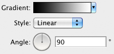
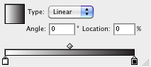
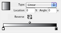
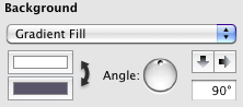
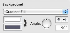
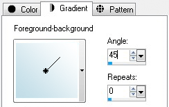
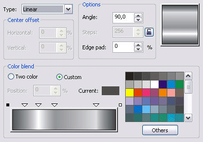
Even when the software allows the designer to use a tool to interactively choose the gradient angle, the angle is still typically represented as degrees in some settings palette or box. An exception to this rule is Gimp, which has no apparent way to set or view the gradient direction as numbers or text.
The idea of specifying a linear direction via an angle this way is also older than any software program. It is also present in protractors and in geometry texts. Note that in all the software examples above*, the angle follows the same conventions as the protractor and geometry texts, in which the angle is a 2-dimensional direction (in much the way compass directions, such as "North-East", are 2-dimensional directions), and not the way programmers or SVG authors might think of them (as a gradient drawn in some default direction and then rotated clockwise by the angle). This should be the model used for CSS, to be used by a much larger (hopefully) group of authors.
*An exception to this rule is Paint Shop Pro, which has 0 degrees pointing up, and angles rotated clockwise from there.Most protractors, besides showing degrees starting on the right and progressing counterclockwise, also show degrees starting on the left and progressing clockwise, but zero is always horizontal and 90° is always pointing up.
The current working draft does include a synax that is very clear to anyone familiar with these conventions, and with the dominant Adobe apps and other software. It allows you to pick an angle and specify it in the same sort of degrees, and then specify the two colors:
linear-gradient(0deg, white, black)As with most of the software applications that let you specify the angle and colors from a palette or toolbar, this CSS will fill the entire box/selection with the gradation fill. When you want the gradating part of the fill to begin somewhere other than the very beginning of the fill (the default is with the end colors at 0% and 100% of the entire gradient path), that is also done in a way that is very similar to users of the Adobe software:
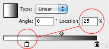
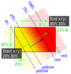
linear-gradient(0deg, white 25%, black)or...linear-gradient(0deg, white 25%, black 100%)As with the design software, the beginning color still begins on one side or corner of the box and the ending color ends on the opposite side or corner, but the actual gradation/blending of one color to the other begins where you set the first color-stop (at 25% of the entire length, in the example above) and ends where you set the color-stop. The 0?100% range always intersects with 2 opposite sides or corners, even when angled, as in the following example for
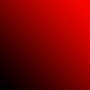
linear-gradient(45deg, yellow 25%, red):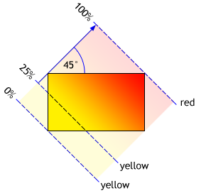
Thus, using this (<angle>,<color-stop-list>) syntax present in the current draft should be very easy for most designers and authors to understand or learn quickly, and to recognize and visualize the meaning of a specified gradation in a glance.
-
Code Simplicity is Good
The CSS code above is simple, short, clear, easy to read, easy to write, and easy to learn. But it is not quite enough. Web designers will also need to be able to have an angled gradient whose ange changes with the box shape.
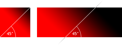
For instance, an author may want a gradient that follows a corner to corner path, wherever those corners may be. So while, for instance, a 45 degree angle may describe the path from corner-to-corner on a square, it does not do so on a more elongated rectangle, as seen in the following two examples for
linear-gradient(45deg, red, black): -
More Ways to Do the Same Thing are Not Always Better
The simple angle syntax already has more than one way to write equivalent angles, which by themselves are pretty easy to suss. For instance, because percentages are optional when they are on endpoints or are evenly spaced, all of the following will create the same gradient:
linear-gradient(90deg, black, orange, white)linear-gradient(90deg, black 0%, orange 50%, white 100%)linear-gradient(90deg, black, orange 50%, white 100%)linear-gradient(90deg, black 0%, orange, white 100%)linear-gradient(90deg, black 0%, orange 100%, white)linear-gradient(90deg, black 0%, orange, white)linear-gradient(90deg, black, orange 50%, white)linear-gradient(90deg, black, orange, white 100%)This is a convenience that allows the gradient to be written even more simply when the distribution of colors can be inferred, while still allowing the very understandable explicit locations to be specified (whether for non-default locations, or just for emphasis or consistency in a style sheet). Each and every one of the forms above can also be reversed. For instance, the following two forms create the same gradient:
linear-gradient(90deg, black, orange, white)linear-gradient(-90deg, white, orange, black)This is also very clear, conforms to all expectations, and adds a simple convenience. It also allows an author to avoid the use of 'calc()' when a single fixed distance is needed, as in the following two equivalencies:
linear-gradient(90deg, orange, white cal(100% - 500px))linear-gradient(-90deg, white 500px, orange)There are also the normal ways to express the angle using different units, something which allows the author to use whatever is most familiar or convenient, without changing the structure of the syntax:
linear-gradient(-90deg, white, black)linear-gradient(270deg, white, black)linear-gradient(-100grad, white, black)linear-gradient(-1.57rad, white, black)In all the examples above, the flexibility to specify the gradients in more than one way is a good thing. It allows for shortened versions or more explicit versions, a reversibility convenience, and a flexibility of units, but does not significantly complicate the syntax, nor make it harder to read and understand (quite the opposite, in fact). The direction is still always specified in the same place, and the indications of where the colors change within that angled line is very consistent. This makes all the various forms above remain simple and easy to understand: easy to learn, read, and write.
Overlaying another coordinate system to create the same gradients, on the other hand, takes away from this simplicity and understandability. If there are two or three very different ways to write the same gradient, that use completely different families of values specified in different places, then it only serves to confuse those who are learning the syntax. One who assumes that the differences of form produce meaningful differences in the result would be hard pressed to discover that difference. For instance, consider the following, which also all create the same gradient (with only one of the degree variations from above shown):
linear-gradient(90deg, white 10%, black 90%)linear-gradient(bottom to top, white 10%, black 90%)linear-gradient(0 bottom to 0 top, white 10%, black 90%)linear-gradient(right bottom to right top, white 10%, black 90%)linear-gradient(50% 100% to 50% 0%, white 10%, black 90%)linear-gradient(-100in 100% to -100in 0%, white 10%, black 90%)linear-gradient(left 0 bottom 10% to left 0 top 10%, white, black)linear-gradient(0 90% to 0 0%, white, black)linear-gradient(right 90% to right 0%, white, black)linear-gradient(50% 90% to 50% 10%, white, black)linear-gradient(-100in 90% to -100in 10%, white, black)The new syntax is shorter and does illuminate some of the ways to write write the same direction, yet is even less obvious in clarity of meaning to the uninitiated, as to what most of these mean for the direction of the gradient (it is harder to guess how a position translates into a direction, compared to having just an angle):linear-gradient(90deg, white 10%, black 90%)linear-gradient(bottom, white 10%, black 90%)linear-gradient(center bottom, white 10%, black 90%)linear-gradient(50% bottom, white 10%, black 90%)linear-gradient(50% 100%, white 10%, black 90%)linear-gradient(-100in 100% 90deg, white 10%, black 90%)linear-gradient(left 50% bottom 10%, white, black)linear-gradient(0 90% -90deg, white, black 11.111%) /* I think */linear-gradient(right 90% 90deg, white, black)linear-gradient(50% 90%, white, black)linear-gradient(-100in 90% 90deg, white, black)In fact, there are now, with this notation, an infinite number of ways to specify the same gradient, each one detracting from the simple readability of the angle syntax. Anyone trying to make sense of the gradient in an existing stylesheet now has to visualize where the first point is in 2-dimensional space, then where the second point is, and finally the angle of the path between those two points. Or, when combined with a degree, they need to remember that the other end of the gradient line is now divorced from any rotated offset constraints, making the location of the gradient line asymmetric within the box and possibly complicating the decision of where to put the final color-stop. But because the gradient path procedes in a single direction, there are an infinite number of parallel paths that can start and stop from other points to get the same gradient, and the extra information about which parallel path to use is really just extra noise:
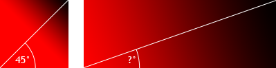
 The diagram above is really an issue from the previous draft that the new draft doesn't have, at least not in this form. Instead, the new draft does allow a degree to be combined with the point. So in the diagram above, you can still have an infinite number of starting points combined with '90deg' for the same result. With diagonals, this 'infinite ways' issue is not present in the current draft, because the angle is not enough to guarantee the gradient will stretch across the whole box in the way a single point will.
Because one author could use angles and another paired points, and because of the multiple ways to specify direction using points (sometimes combined with angles), and because of the multiplicity of specifying the first and last color stops as either points or as proper color stops, there will be little consistency, and confusion will proliferate. Those learning from other's examples may not realize there is a simpler, easier-to-read angle syntax that could often be used instead of the longer, more variably-worded <bg-position> syntax. And sympathies go out to such a learner who tries to make sense of a non-obvious single point as an indication of direction (because the second point is not written, but generated):
linear-gradient(20% 80%, red, black)linear-gradient(top, red, black) /*towards the top or from
the top?? It is not obvious that 'top' means "downward". */At least 'top to bottom' is clear in meaning. 'Top' by itself is not.
And woe to those who forget the proper order of the two values in a background position point: Is it vertical first like all the CSS properties that deal with 4 sides but also allow to list just 2 values if you want, or is it "x" first as for an x-y coordinate ? Many of us have to stop and think about this every time we manually type background positions.
It would be better if, instead of having so many extra ways to specify the same gradient using a whole different syntax, if we could instead just keep the simplicity and consistency of the angle syntax, but also indicate (via a keyword, for instance) the behavior of letting the angle stretch with the box shape.?Because that is the primary value that does exist in the <bg-position> syntax: the ability to have the gradient angle stretch to conform to different image box dimensions, instead of always being a fixed, set angle in the final rendering.
-
Most Gradients will be Simple
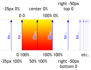
Gradients already deployed to the Web are typically created with background-image and raster files. An efficient way to do this is to have a gradient that is one-pixel wide or tall, repeated in one direction (horizontally or vertically). Since 'background-size' has only fairly recently become available in newer Web browser versions, these gradients are typically of fixed size. The following is an example of how this widely-deployed technique for creating gradients can be recreated with linear-gradient() and no raster images:
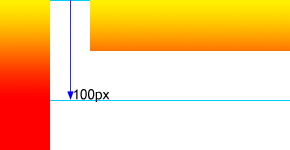
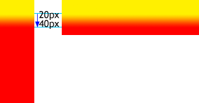
Another common pattern using background-image is for a gradient to start blending at some fixed distances from an edge, so that there will be more of the beginning color and less blending:
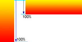
Of course, with a gradient function, more possibilities are opened up, including gradients that stretch the entire distance of the box, regardless of box dimensions (in fact, this is the simplest to create, when the angles are multiples of 90 degrees). We can certainly expect this form to be popular:
I believe we can expect to see the majority of gradients fitting into one of the patterns above: either running for a fixed distance or blending from one end of the box to the other, and possibly starting at a fixed distance. Based on existing tends in gradient use (or at least, my general impression of their existing usage), both on the Web (including technologies such as Flash) and off, it is also reasonable to assume the following:
- Most gradients will be linear gradients
- Most linear gradients will be simple two-color non-repeating blends,
- The majority of those will be either horizontal or vertical, but diagonal gradients will also be a significant portion.
The language should thus be optimized to these uses then, retaining its simplicity for specifying these types of blends, and let the more marginal edge cases be handled in some other way (such as SVG). But instead, we have added on a system of dual 2D coordinates (<bg-position> points) to indicate the gradient angle between them. Then we tried to mitigate its complex verbosity by having omitting a point from the syntax and utilizing a non-obvious rotated-point effect instead. There is a better way.
What's needed would be something that could angle the gradient more flexibly, conforming to the dimensions of the image box (as other image types do when they are resized), like this:
A recent draft solves this problem by allowing the author to substitute a pair of coordinates (like those used in 'background-position') to define the beginning and ending of the gradient line, instead of using an explicit angle. Thus, the example above could be written like this:
linear-gradient(left bottom to right top, red, black)
That seems reasonably clear. However, by using background-position there, it opens up a new can of worms...
However, by using background-position there, it opens up a new can of worms. Because now you can not only use that argument of the function to set the angle flexibly, but you can also use it to set the starting and ending points of the gradient, a capability that was already present through the "color-stop" arguments. So for instance:
linear-gradient(20% 80% to 80% 20%, red, black)
This example asks you to imagine the angle of the line by first imagining the starting and ending points as offsets from the upper left corner: the beginning of the gradient path is 20% from the left and 20% from the top, and the ending point is 80% from the left and 80% from the top. Woe be to you if, like me, you have to stop and think whenever having to specify <bg-position> coordinates in the correct order, which—unlike padding, margin, borders, and others when only writing two of four distances—require the horizontal part to be written before the vertical part.
Then the distribution of the color stops (normally falling within 0?100%) is scaled down to fit inside this new gradient line, instead of referring to the dimensions of the original box. So, for instance:
linear-gradient(20% 80% to 80% 20%, yellow 25%, red 75%)
This illustrates the more complex model of superimposing two different coordinate systems on top of each other for determining where the colors begin and end: one for specifying the position of color stops along a one dimensional path, and another (outside of that) for specifying two points within a two dimensional space. The example above is illustrated here:
linear-gradient(20% 80%, yellow 25%, red 75%)
That is a lot for the author to try to picture in his mind. Then consider that the whole image could be sized down and then further positioned within the background of an element via normal background properties, with the color possibly continuing outside the image via an additional proposed 'extend' keyword, and you have these two systems of determining color start and stop positions now surrounded within yet a third.
"But wait," you say, "Nobody is really going to be specifying a gradient that complex too often, so the complexity argument doesn't hold water. And for those who do want to do include this sort of complexity, they can do so, because that complex form is included for free if we use the <bg-position> syntax." But it is not "for free" if it adds confusion and multiplicity to something that is otherwise very simple. And if it is not needed except for extreme edge cases, then it we should look for a better way to solve the "corner-based-malleable-angle" need, a way that is more optimized for simplicity (of both reading and writing the values), a way that is not that different from the familiar way that gradients and directions are commonly specified in text.
A Different Solution
I propose that we do away with <bg-position> points for linear gradients altogether, and stick with a consistent format of (<angle>,<color-stop-list>). Instead of using <bg-position> for the diagonal blends that flex with the box, we would add a single optional keyword. This keyword, when included immediately after the angle, tells the U.A. to let the angle conform to the box dimensions, just as they would in other pre-generated image formats. SInce most gradients will be in multiples of 90deg (given that this allows them to align with horizontal and vertical elements such as text and images), the extra keyword is only needed in a minority of cases, and the simplest form is used most often.
This negates the biggest value of <bg-position>, and lets us use a single method to generate linear gradients that is simple, familiar, and extremely easy to read and learn and understand.
How this would work:
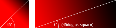
Since the gradient box has no intrinsic dimensions or aspect ratio, it might seem that there is no angle you could specify to indicate a gradient path that e.g. always connects two corners. To have a gradient go from the bottom left corner to the upper right corner might be 5deg on a very short and wide box, or 95deg on a very narrow and tall box. So what we do is pick an angle that would work on a square, and then let the square stretch to whatever the final dimensions of the box end up being. For example:
linear-gradient(45deg as-square, red black)
This says that if the image were a square (that is, if its width and height were the same), then the gradient angle would be 45 degrees. For other aspect ratios, the angle changes just as it would if this was a square PNG image that was being resized. But the image still has no intrinsic dimensions or aspect ratio, and thus still acts the same in a 'background-size:auto', 'background-size:cover', or 'background-size:contain' background as as it would for 'background-size:100% 100%'. Thus, for the code above, we get a corner-to-corner gradient, whatever the dimensions of the box:
For "bottom left to center right", we write this:
linear-gradient(22.5deg as-square, red black)
to get this
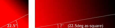
This keeps everything simple and consistent, because we are only dealing with degrees to indicate linear direction, nothing else, and only adding a single keyword to indicate if the angle can change as the aspect ration changes (as it would in other image formats), or if it retains that angle regardless of deformations to the box. Note that this is much easier to conceptualize than to mentally parse two sets of coordinates and then draw a mental line between them in your mind.
So what do we give up?
With a reduction of complexity there is often a reduction in power. But in this case we are not giving up much that cannot be handled in other ways. In fact, I can only recall two other uses case put forth for doing something using bg-position notation within the image that would be difficult otherwise, but we can deal with that case fairly easily:
Aligning an gradient to some content:
OK, this is a case that only matters in certain limited situations. For instance, if a gradient doesn't start exactly where the content start (such as with another image inside some padding), you most likely won't notice unless you are attempting to start the gradient with a sharp line. Otherwise, the blurry nature of color blends makes it hard to see where the exact edge would actually be. Also, this use case assumes that it is more important to align the beginning and/or ending colors with some content than it is to align some other color in the middle, a questionable assumption at best. And you could only align the ending color this way in certain very exact circumstances, since it only is there as a rotation of the first point.
So, lets say you wanted something like this (using the bg-position notation first):
linear-gradient(20px 20px -45deg, white 0%, black 0%, white 0%)
This means, start at a point 10px from the left and 10px from the top, then angle the gradient line down and to the right 45 degrees. That might get you something like the following, if the gradient was a background-image on an element with 20px padding, and a picture child that the sharp starting gradient edge was supposed to touch:
One simple solution is to figure the distance from the corner to the hypotenuse, and enter that as the distance of the first stop (or just try some different approximations until you get what you need). Thus, you could do this:
linear-gradient(-45deg, white 29px, black 29px, white 0%)
Or, if you are using the image as a background image (as in the illustration above), then just use the regular background properties to align the beginning of the gradient. We can perhaps expect the background spec to eventually be extended so that either the colors of the gradient will be automatically expanded beyond its normal background-size, or they will do so via a keyword like 'expand'. Thus, you could have this:
background-image: linear-gradient(-45deg, white 29px, black 29px, white 0%);

        background-position: 10px 10px;

    background-repeat: expand /* dont repeat; expand edges */;
Throw some calc() into either the background size or the last stop if you need the gradient to stop at the bottom right corner. This is already an edge case, so it is OK to go to that extra effort here for such an exact and unusual need. If you want the gradient to line up even when going corner to corner instead of strictly by an angle, then you have an even more limited edge use, but you can still get there, or pretty close, using either of the techniques above combined with 'as-square' in the gradient image. The first technique will usually be within a pixel or so if it is close to the corner, while the second one can give you even more exact results.
Thus, the need for using <bg-position> notation within the image is not strong enough to warrant the extra complexity, when compared to just using degrees and an optional keyword. Let's keep the business of determining the precise locations of the colors to where they belong, as color stops. All that is needed to determine the direction of the gradient is an angle, and a determination of whether or not that angle should change with changes to the image dimensions.
Plain English for Common Gradients
It can certainly be argued that there is little that is less clear than "top to bottom", "bottom to top". "right to left", and "left to right" for indicating a horizontal or vertical gradient. It is the extra baggage of thinking of these as background positions that cause the problems outlined in this document. However, they may be useful as something similar to shorthand versions of the corresponding degree-based gradient direction indicators. So for instance, we could allow the "bottom-to-top" to mean the same thing as "90deg" for linear gradients, and to be serialized as "90deg". If this is desirable, we could also consider corner-to-corner keywords to act the same way, so that 'bottom-left-to-top-right" was just a substitute way of saying "45deg as-square". This does re-introduce a little of the redundancy that we removed by removing <bg-position>, but in a very limited and contained way.
Brad Kemper,November 2009 — October 2010